Saturday, 27 April 2013
Friday, 26 April 2013
Ancillary Task 2 - Print Advert
This is my Final Print Advert, I am very pleased how it has come out and I think it is rather captivating to say the least. To do this particular task I used the programme (photoshop) which was to begin with challenging as I forgot some of the steps. By watching Youtube tutorial clips it allowed me to familiarise myself with the programme again.
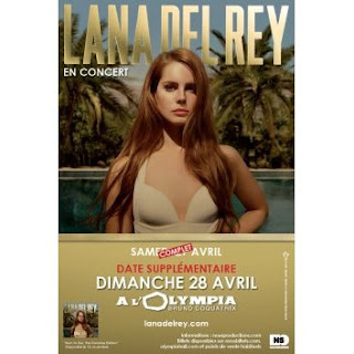
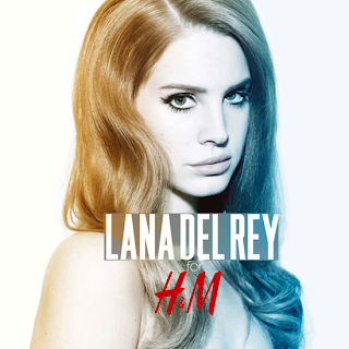
I looked at many print ad's which at first I found it hard to find via the internet as many artists have stop using them for promotional purposes. I came across some from my chosen artist Lana Del Rey.
(As shown below)


From these particular examples I noticed they were very plain, which I believe I embodied in my particular ad, as I did not want to add too much things such as social networking site logo's (Facebook, Twitter) and so on.
Here is my initial idea behind my print advert:
This was my initial idea for the print advert, I felt it was effective, and when showing some of my target audience they also felt it was striking. However some feedback I gained was that the photo was capturing but the rest of the layout doesn't make it pop as it should do. My media teacher felt that the red did not work in this particular case whereas it worked well for my digipak.
He also felt that much text was not need, he also brought to my attention that I used the wrong iTunes label, as I felt it worked well due to the whiteness of it which I felt correlated well with the font colour.
With taking all the comments on board, I felt I did exactly what was needed, I changed the positioning of the artist's name and also the colour of the title, I felt the white popped out and was eye catching which essentially is a good thing as you would want the audience to be drawn to it.
When showing my teacher this version he liked some aspects of it but still thought I needed to make some changes such as dragging the photo of Chisara Duru (my actress) right to the top of the page, and change the star colours to a gold or yellow. He also wanted me to put more social networking logo's but when in the processes of making the changes it looked too cluttered.
I felt I made the right changes which highlighted in the end result of my print advert which I find to be very effective and eye capturing.
Thursday, 25 April 2013
Research - Into Print Adverts for a CD album release
Advertising research - is a specialised form of
marketing research conducted to improve the efficiency of advertising.
There are two types of research, customised and syndicated. Customised research
is conducted for a specific client to address that client’s needs. Only that client
has access to the results of the research. Syndicated research is a single
research study conducted by a research company with its results available, for
sale, to multiple companies. Pre-market research can be conducted to optimize
advertisements for any medium: radio, television, print (magazine,
newspaper or direct mail), outdoor billboard (highway, bus, or train), or
Internet. Different methods would be applied to gather the necessary data appropriately. Post-testing is conducted after the advertising, either a single ad or an entire multimedia campaign has been run in-market. The focus is on what the advertising has done for the brand, for example increasing brand awareness, trial, frequency of purchasing.
The adverts main target is to attract the audience’s attention, so using an
image of the artist/band acknowledges the reader to what the advert is selling
Information on what is so different about this special edition album – list
bonus features The advert needs to be aesthetically pleasing, this way the
reader is reeled in and therefore more interested in the advert Quotes from the artist – generally getting to the point and
exciting the reader so they don’t just ignore the advert.A strong interesting
image is intended to grab the reader’s attention, this can be the artist
themselves or an image that represents the band – this is also so that the
advert is recognisable to the audience.
Just an image of the artist would for the ‘die hard’ fans as this is easily
recognisable to them and they instantly know that their favourite band/artist
is releasing a special edition album Adding information about the digipak is
the main seller, as this is why the album is different as it has a variety of
bonus features that the plain album doesn’t, so the reader is more intrigued to
buy it.
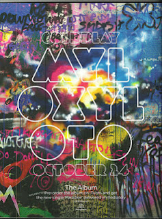
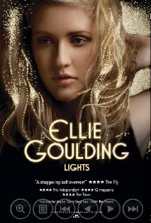
Here are examples of successful Print Adverts:

Coldplay (left)
Florence & the Machine (right)

Jessie J (left)
Ellie Goulding (right)
Sunday, 21 April 2013
Ancillary Task 1 - Final Updated Digipak
This is my updated final digipak, I felt the other digipaks i created were fine, however by getting some feedback from my audience most of them pointed out I had the incorrect font style.
To get the same style of Lana Del Rey's album 'Born To Die' I simple went on a font website called 'dafont' which had a range of fonts. I found the one that matched the best with the original album 'Born To Die' font was called 'Steelfish'
Here's a image of the website and font I used:
I then downloaded the font and used it for my digipak, I believe it fits perfectly and I am very happy with the end result of it.
Also my Media Teacher highlighted to me that it is in fact suppose to be a album cover not a single, which I then changed. As before hand I only had the title of the song and no other songs on the back. He also gave me some good constructive criticism which I took on board as I want the best results out of this.
The changes which were needed were the: font size on the back of the album cover, having additional writing under the barcode, having a continuity of the inside right and inside left cover and so on. These little things I then added (as you can see from the above image of the digipak) made such a big difference.
The changes which were needed were the: font size on the back of the album cover, having additional writing under the barcode, having a continuity of the inside right and inside left cover and so on. These little things I then added (as you can see from the above image of the digipak) made such a big difference.
At first I was a bit thrown off by what my teacher said, I did not no exactly where I went wrong, however by looking at Lana Del Rey's album cover again, allowed me to critically analyse my digipak.
Here below is the album:
Although I am happy with the end result of my updated digipak I did have some trouble whilst editing it on Photoshop. I particularly was getting frustrated by this as I believe I am good at using photoshop as I have used it whilst doing photography and so forth. As soon as I thought I created an effective digipak, and getting positive feedback, when showing my teacher he highlighted some errors which I still managed to encounter.
Here is an example of my initial final digipak:
I was very pleased with this particular digipak after making the changes which were required, however despite getting positive feedback from my target audience my teacher spotted some errors. Such as the barcode being in the incorrect place (although I felt I was being conventional to the artist as this is seen on her album cover).
However with that being said I did move the barcode and resize it as it was far too big after critically analysing it myself. Also my teacher pointed the both the inside left and right images were stretched out, also the front cover image was slightly stretched and needed to be moved slightly to its left.
We both noticed that the text on the front cover was slightly difficult to read, this then led me to make the changes.
I found it easy resizing the barcode, and also altering the front cover. However when trying to figure out how to make the text on the front cover readable, I was stuck. Luckily a fellow Media Student (Marianne) showed me different techniques which allowed me to put a shadow effect on the text.
Down below is the before and after whilst editing the words 'Serial Killer':
As you can see I used 'layout style', which had a range of font styles. The best one which suited my font was 'Drop Shadow' this made my font more bold and could be easily read, which I was very happy with the result.
I found trying to resize my images from the inside left and right was extremely difficult for me, I tried everything in order for the images to not look stretched out but everything I seemed to do did not work for me. At that point I really wanted to give up and just leave it, however I did not do that as I want to make sure I achieve level 4 band for my digipak.
After giving myself a break from trying to edit this on photoshop I looked at other images I captured whilst doing the digipak shoot. I remembered that at all times I should be selling my artist, which meant I should possibly use a close up photo which enable's to sell my artist.
I then picked a particular captivating image I felt would be very effective.
As shown below:
To make sure I do not have a stretched out image I had to crop the bottom half of the image.
As shown below:
I then selected small section of the image which I then copied on the actual digipak for the 'inside right' which I also did for the 'side right'.
I was very pleased of how the images looked, I also change the side of the images so they could mirror each other when imagining the digipak to be jointed together.
I felt that the images were very strong, however I wanted these particular images to correspond to my
music video, which meant I used a red filter.
Here is the image with the red filter:
Also I think by the theme of my video being mysterious, and the different red filters throughout the video, is why I wanted to embody this within my digipak, which will make them collectively work together, and echo the dark nature of the song title 'Serial Killer'
This was the process of making my final digipak and as a result I am very pleased with the outcome of it (shown at the begin post of final digipak)
Saturday, 13 April 2013
Digipak
After doing rough samples of my digipak here is one I have developed. I took on board some of the comments which I gained from my samples.
Comments:
Tuesday, 2 April 2013
Rough Samples - Digipak
Here is three samples of me testing out ideas for my digipak.
I felt this was a great way to explore different images and see which particular images work and what does not work.
I felt this was a great way to explore different images and see which particular images work and what does not work.
 |
| Sample 1) |
 |
| Sample 2) |
 |
| Sample 3) |
After gaining feedback from my rough samples it brought to my attention that I in fact need to put a image on the inside right, as I assumed it could stay plain. This is why I am glad I did rough samples, as I already had many errors which then helped me when I actually was creating my actual digipak.
Monday, 1 April 2013
Ideas for Digipak Front Cover
Subscribe to:
Comments (Atom)


